ShopDreamUp AI ArtDreamUp

Deviation Actions


Suggested Deviants


Suggested Collections


You Might Like…


Featured in Groups


Comments19
Join the community to add your comment. Already a deviant? Log In
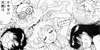
Pros: I like the use of the color violet in this picture. You balanced it nicely with the characters and the background. The purple in the background supports the importance of Hotaru and her daughter. In other words, you made your focus of the artwork clear and that's wonderful. I also like the dress designs; it's simple yet royal-like which doesn't stray far from the show's fashion for the princesses.
Cons: There are anatomy issues. Hotaru's arm is bent awkwardly as she's holding Hatsumi's hand. It doesn't seem Hatsumi is looking directly at he mother's face, but rather her chest (which I feel was pushed up too high) and we have Hotaru staring off into the distance. Hotaru's lips look out of the place for her face... and speaking of the face she has that very slim face line (as if there's not cheek at all). Hatsumi has the same thing and even though she's younger than Hotaru, obviously, she still needs that deep in between the cheek bone and to lower jaw. The way you did the upper highlight of the eyes is confusing because it has that blurry glow and the rest of the eye (that triangle part) is solid white. It's distracting and it just doesn't seem to fit. I think the skin is too pale because the color of the skin is colliding with the white of their eyes and it's like the eye-line disappears. Also, the single shade they were given has this same affect and it doesn't do them justice. The shade itself makes the characters look flat. Speaking of shading I think the dress needs more shadow because you have some places where its shaded and other places where it should be shaded and nothing is there. One last thing; the background you chose is way too distracting. The twinkles and the swirls there you just get lost in there instead of the characters. You want to keep the focus on the characters for as long as you can, not the background. One last thing; your signature and that random white line next to Hotaru have got to go. They're just there and it reduces the quality of the work.
Suggestion: So I think I beat your art piece enough already; let me give you some suggestions. First off, it would be great if you gave something that people can be focused on the two characters. Have their eyes meet each others like a lovely relationship between mother and daughter, since it's about these two. Maybe change up the expression where you have Hotaru giving off a very mature, motherly gaze and Hatsumi a more childlike, cheerful smile. Just so that if someone looks at this piece they can follow from one character to another with their direct eye glances. Next there are few minor anatomy issues you can patch up. The major anatomy problem is Hotaru's arm holding Hatsumi's hand. The arm should be lowered straight and Hatsumi's arm should be lowered as well but still bent. That's only because of her height and the length of Hotaru's arm determines this. If Hatsumi would be any taller or smaller, the arm would be more straightened. For the cheeks, your style is similar to the Sailor Moon's, obviously. But in the art style they still have evidence of cheeks. Take a look at an official artwork of Sailor Saturn [link] . It's there and it's wise to show that it's there otherwise it looks like some weird deformity. With the other minor anatomy issues, just keep in mind of anatomy and look up some anatomy reference sheets here on dA or on Google (just be careful and specific for what you're searching for). For shading, just be mindful of areas where there should be shades. At some places your shades ends disruptively and it loses that dimensional feeling. You should make the shades thicker for this kind of style. For the skin issues, simply darken so that the white of the eyes stick out more and the shadow of the skin sticks out more. Finally the background. Since you have a simple style you don't need an extravagant background. It can be a simple dark gray background with that purple light. For the white border, I'm assuming that was the parts weren't erased when you were outlining and coloring digitally. Just erase it... or be creative and use it as a border (but that would mean you would have to copy and paste it to the other side and crop the picture. For your watermark, I think you could have put it in a place where it wouldn't be so distracting (usually putting near the corners works the best).
![[link]](https://www.deviantart.com/users/outgoing?http://4.bp.blogspot.com/-p7ojZyT85hE/TWEs0yl924I/AAAAAAAAUas/wlLhTruYt1g/s1600/sailor-saturn.jpg)
Final thoughts: This is a great piece you just need to fix a few things here and there and you should be good to go. Sorry for such a long critique but I wanted to make sure that I could find everything that you could improve on. Keep up the good work.